Central Japan: 7 Colorful & Stunning Design Themes
From food to temples to interiors, the Japanese know design. This summer (2018), I was lucky enough to explore another corner of the world with my husband.
If you’ve never been to Japan, I can’t recommend it enough. It is a culture shock of the best kind. Nearly everything — from Japanese culture to history, food to architecture and design — had an incredible attention to detail. Even the simplest, most mundane things became works of art, tradition, craftsmanship, care and beauty.
Admittedly, Japan is a big and diverse place. We only had time to travel through the central part of the country — Tokyo, Nikko, Nagoya, Osaka, Kyoto, Kanazawa — but we certainly hope to go back and explore more soon!
Until then, I hope you can see and admire just some of this rich culture from my most interesting, design-related finds from the central Japan. (And I hope #7 and #9 give you a laugh!)
Pour a glass and come travel with me…
![]()
1. Elegant & Inspiring Paper & Metal Lanterns
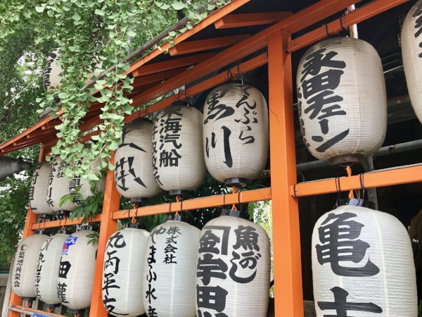
Paper lanterns in Tokyo, Japan
Japan is well-known for its many styles of lanterns, paper especially. They can be found embellished with writing, scenic drawings, or left unadorned. In a home, they add a delicate, ancient feel that serves decorative, religious, and light-providing functions in Japanese culture.
In the US, I’ve seen paper lanterns used in mixed-modern spaces to beautiful effect (such as Isamu Noguchi’s famous paper lantern designs).
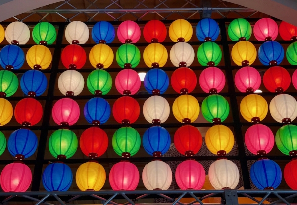
Paper lanterns in the city market, Nagoya, Japan
This more modern-day and colorful paper lantern exhibit greeted us from an archway in the city center of Nagoya. Vibrant colors made the center feel fresh, young, and fun but still embraced the country’s ancient culture. A lovely blend of old and new.
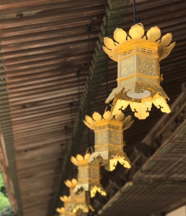
Golden lanterns in the UNESCO-protected temple settlement, Danjo Garan, Mt. Koya, Japan
Okay, these lanterns are not made of paper, but aren’t they beautiful? These lanterns above are hardly bigger than a soup can! Now you can really imagine the extent of detail here — the tiny cutouts, the impressions in the metal, the subtle but uniform curves. Simply stunning.
We found these hanging from the rafters of one of many temples in Mt. Koya, a UNESCO heritage site filled with ancient temples and shrines, kind monks, and abundant nature. If you have a chance to visit, it is a a soul-soothing place brimming with beauty.
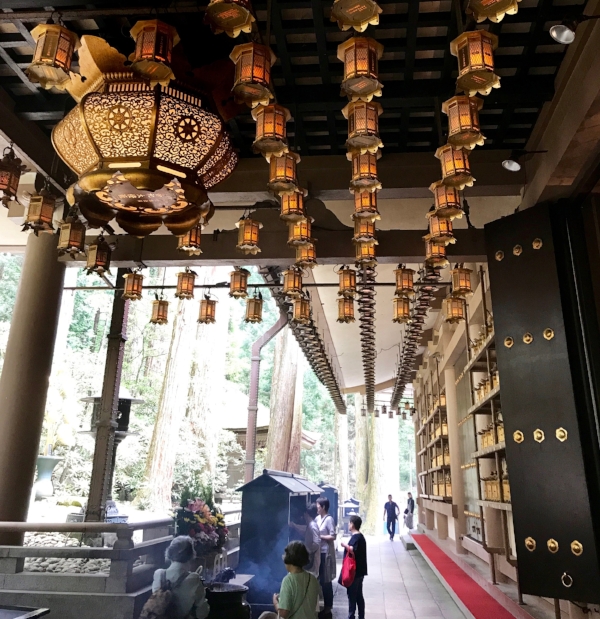
Hanging lanterns in Nikko, Japan
You’ve also probably noticed updated versions of these types of lanterns in design today… such as the lanterns we see in farmhouse and modern-farmhouse interiors! Knowing this modern-day trend made it especially fun for me to see some of lanterns’ ancient roots.
P.s. I left the people in this photo so you can just HOW TALL that door is.
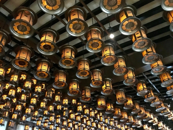
Metal hanging lanterns outside a temple in Nikko, Japan

2. A Wide Variety of Design in Ancient Temples
Breathtaking temples and shrines are infamously one of the highlights of sightseeing in Japan. Although we sought out some of the more celebrated sites (like Mt. Koya), there is beauty to be found anywhere you go.
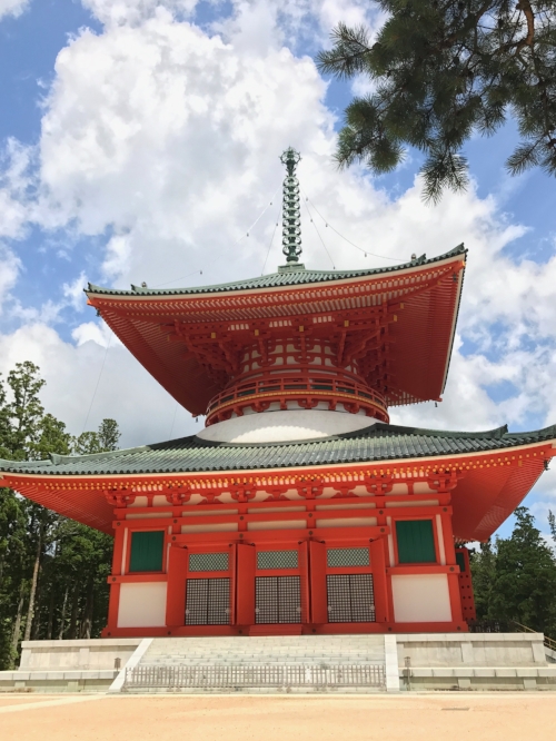
“Red Pagoda” in UNESCO-protected temple settlement, Danjo Garan, Mt. Koya, Japan
This giant “red” pagoda (I swear it looked more r’orange than red) was my favorite from the whole trip. We were lucky to see it on one of the few sunny days we had, because the contrast of r’orange against the backdrop of blue sky was simply spectacular.
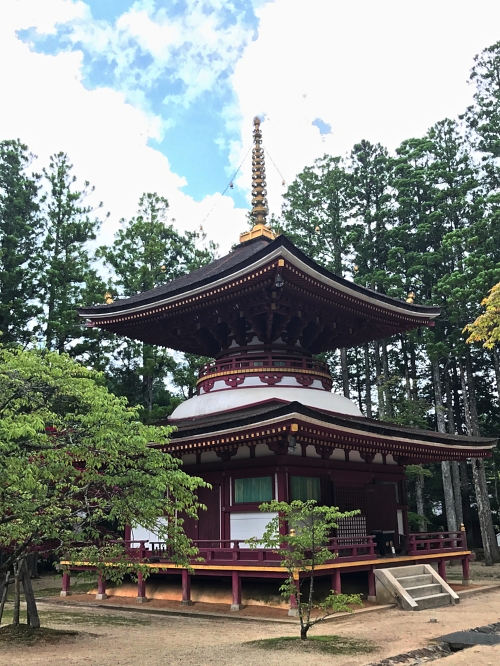
A burgundy and gold beauty that captured my heart in the Danjo Garan complex in Mt. Koya, Japan
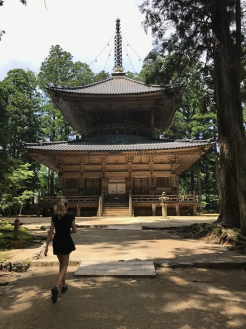
Mt. Koya, Japan
And by contrast, a completely unpainted, unadorned wooden temple. Despite the lack of colorful grandeur here, I really loved how the raw, carved wood created a soft and welcoming vibe. It’s simple but majestic. Sometimes the best design is the simplest one.
Here are just a few more for you to see the variety and details…
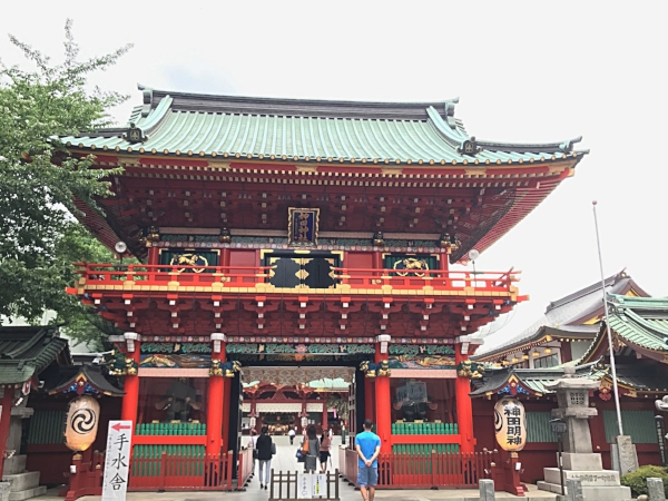
Temple entrance in Tokyo, Japan. Hey, I know that blue guy!
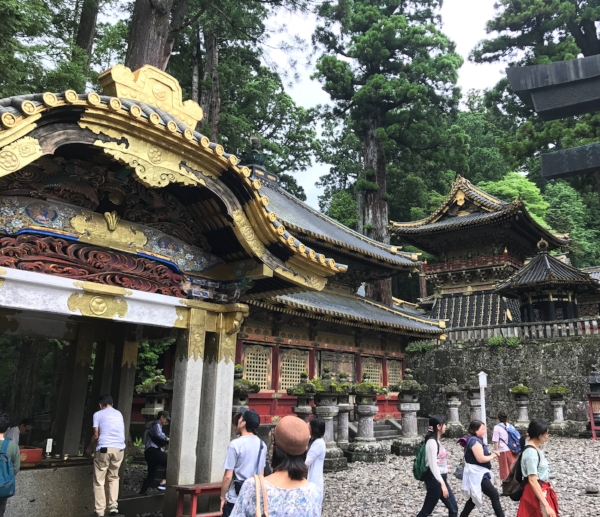
Village of shrines and temples in Nikko, Japan. I love these intricate details!
Okay, just one more…
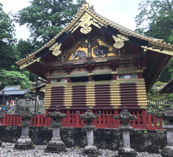
From a village of shrines and temples in Nikko, Japan

3. Interesting Contemporary Japanese Architecture
With ancient, incredible shrines and temples nearly every block, the beauty of the contemporary architecture was a pleasant surprise. Here are just a few that fascinated me…
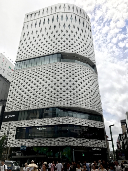
Ginza Place in downtown Tokyo, Japan
How cool is this design? It’s geometric. It has movement. The elongated section at the top makes it look even taller. True, this design falls under the architecture (not interior design) category, but I’ve seen interior design use these same principles to make spaces seem larger.
Inspiration is everywhere.
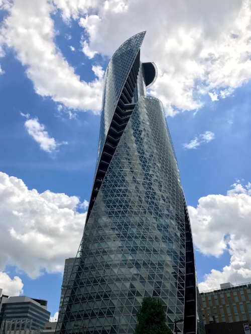
Mode Gakuen Spiral Towers in downtown Nagoya, Japan
Did you notice that this structure includes not one, not two, but THREE interconnected towers? I also love how the exterior looks opaque, but once you see it from the side, you realize it’s actually comprised of connected windows. Impressive!
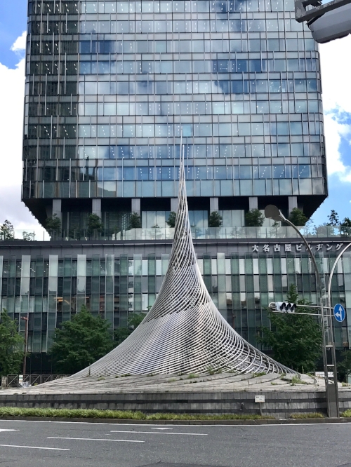
Metal sculpture in a traffic circle in Nagoya, Japan
Okay, this one isn’t a skyscraper, but I find this sculpture so creative and intriguing. I wonder if its smoothly flowing, circular shape helps traffic move more gracefully through the roundabout? Maybe we should try it in California… 😂
![]()
4. Details in Japanese Design that Surprised Me
Nearly every photo so far includes intricate design details, but I want to share a few more that either gave me a laugh or made me say ooooh.
I originally took the photo below for the black and gold lattice-like design under the roof. I love how the same shape was alternated, building on itself in such a beautiful way.
But when I looked at this photo after the fact, I noticed…
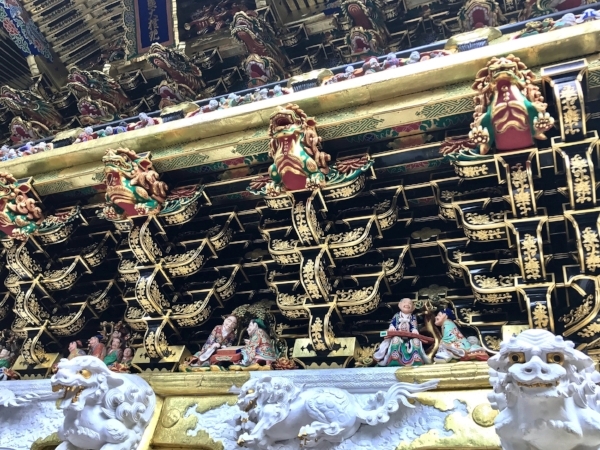
Decorated eaves in a temple in Nikko, Japan
That creepy white dragon staring at me from the bottom right corner! Disconcerting, right?!? They do say the devil is in the details…
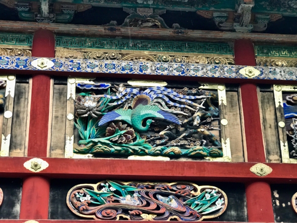
Temple decor in Nikko, Japan
Okay, the craftsmanship here is truly remarkable, and I love the rich colors. The entire scene was carved from wood and then painted, and you can see the depth and detail from several feet away. (The three layers of different patterns above the peacock scene are worth noting, too.)
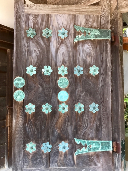
Entrance to a temple in Mt. Koya, Japan
I don’t think this simple wooden door intended to take any of the spotlight away from the temple beyond it, but I couldn’t resist this beautiful aqua patina that resulted from the copper aging likely over centuries of time.
This door made me think about how materials react to time. I know most interior design clients want a “timeless” look so they don’t have to redo it in a few years. Choosing materials that patina and age with grace is a nice way to help accomplish this.
5. Traditional Japanese Bedrooms & Bathrooms
We couldn’t stay in Japan without having the REAL experience of Japanese interior design. We found this little room in a beautiful guesthouse in Nikko, Japan. (FYI: Nikko was probably my favorite stop on our trip.)
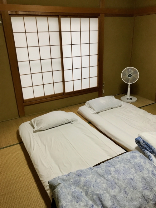
Adorable guest house in Nikko, Japan
First, you can see that the sliding window screens (shoji screens) are covered with translucent paper, which allowed a nice glow of light (but not heat) into the room when closed. Ancient innovation at work.
Next, traditional Japanese flooring consists of these thick, woven straw mats called tatami mats. They added a woodsy fresh scent to the room and were quite comfortable and soothing to walk on. (Did you know that softer materials like these are actually good for your back health?)
Truth be told, an extra layer of padding made the mattress set-up above pretty comfortable. Unfortunately, the mattresses we experienced at three other places consisted solely of a duvet-thin pad…so we were basically sleeping on the floor. (Ouch.)
In general, though the novelty was fun at first, I can’t say I really liked sleeping so close to the floor. It sort of felt like I was crawling around on my knees like a kid half the time or stooping awkwardly. I’m glad I tried something new, but I’ll stick with mattresses and frames!
![]()
The Throne Room
Yep, I’m going there. I know talking about “the throne” might be a little taboo, but I’d wager big money on your home having one, too, so here we all are.
Now that any discomfort is out of the way, just look at all these settings!

Bidet-style toilets are undeniably the norm in Japan. I had heard this from a friend before the trip, but I still couldn’t believe my eyes when I saw bidet after bidet in every toilet of every hotel, restaurant, coffee house, and museum we visited. Everywhere!
While my husband didn’t bother curbing his enthusiasm to try one, I was a little more skeptical. Call me shy, haha.
No surprise, but curiosity won out after a few days, and I’ll just say that it wasn’t so bad! I even miss them a little bit. Better than sleeping on a hard floor, in any case.
2020 Update: Bet you wish you had one of these when people were hoarding toilet paper! Lol.
![]()
6. Design & Experience in Food Culture
The food culture in Japan is just as steeped in design as their interiors, architecture, and religious sites, which is why I just couldn’t resist sharing these photos with you, too.
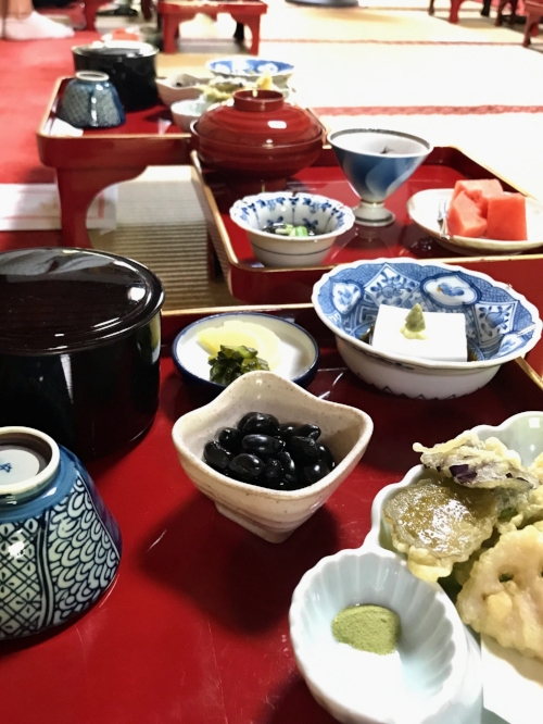
Delicious vegetarian meal grown on site and made by monks in Mt. Koya, Japan
In Japan, there is excellence in simplicity, and it couldn’t have been more apparent than in this beautifully prepared meal. And in this case, the design absolutely affected our experience.
Every small element was given its own space to shine, ensuring that we treated each dish with the attention and appreciation it deserved — and we felt gratitude to the cooks who had taken such care in preparing it.
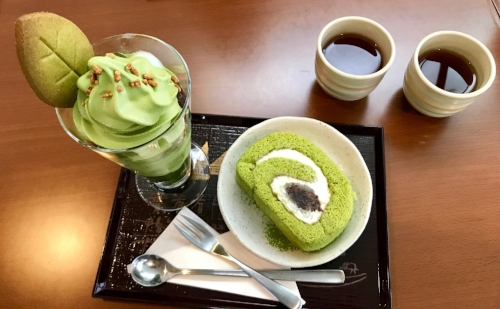
Matcha ice cream parfait, matcha and black bean cake, and a deliciously delicate roasted brown rice tea
Mmm, matchaaaa. How gorgeous is the green color of this cake? Matcha is typically bitter, but — like any good design — the sweet frosting and bean paste perfectly balanced it out.
Call me crazy, but I actually loved the roasted tea more than the ice cream and cake. So much depth of flavor in one tiny little cup. Okay, TWO tiny cups… I drank D’s when he wasn’t looking. Muahaha.

Matcha stop!
A little disheveled but happy! 95° heat and 90% humidity aside, I think we all know that traveling isn’t quite so glamorous as Instagram makes it look. 😉
![]()
7. Beautifully Designed Gates & an Unwelcome Surprise
Gates are a large part of Buddhism and Shintoism and are ALL over Japan. Admittedly, I’m neither of these religions, but I could appreciate them from a design standpoint nonetheless.
They’re beautiful, majestic, and seem to emanate a quiet power wherever they stand.
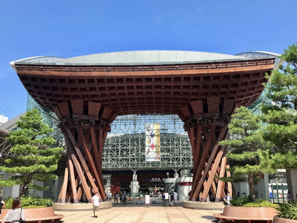
Gate leading to the train station in Kanazawa, Japan
This gate in Kanazawa was my favorite. The way lines turn to curves fascinates me. It blends a handcrafted touch with an almost industrial feel. I love the red richness of the Cyprus wood, too.
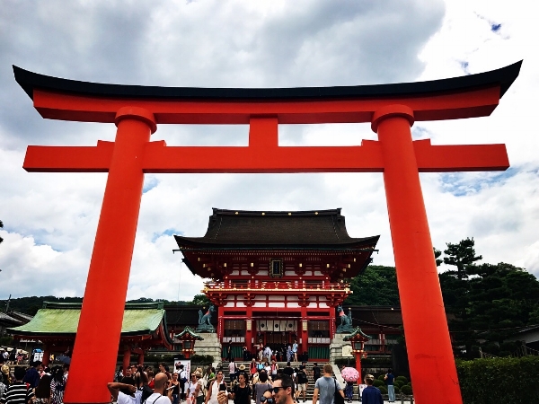
Gate leading to the famous shrine, Fushimi Inari Taishi, in Kyoto, Japan
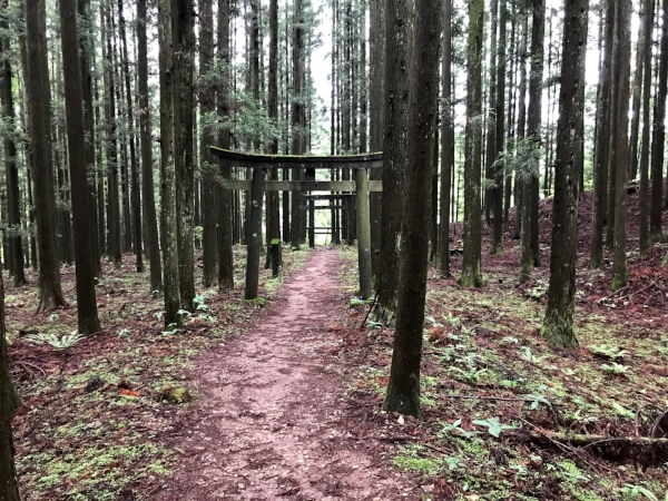
Gate in the forest behind our guest house in Nikko, Japan
Can you see the gate hiding among these trees? This one in particular beckoned us toward a path through the woods, which we were happy to explore. Our happiness was short-lived, however, once we realized that the area played home to…
Leeches. Hundreds and hundreds of leeches.
Did you know leeches can bite through socks AND shoes? (D. found out the hard way…) And that they can climb right up pant legs no problem? Gotta love nature!
Okay, one last photo just because it’s beautiful…
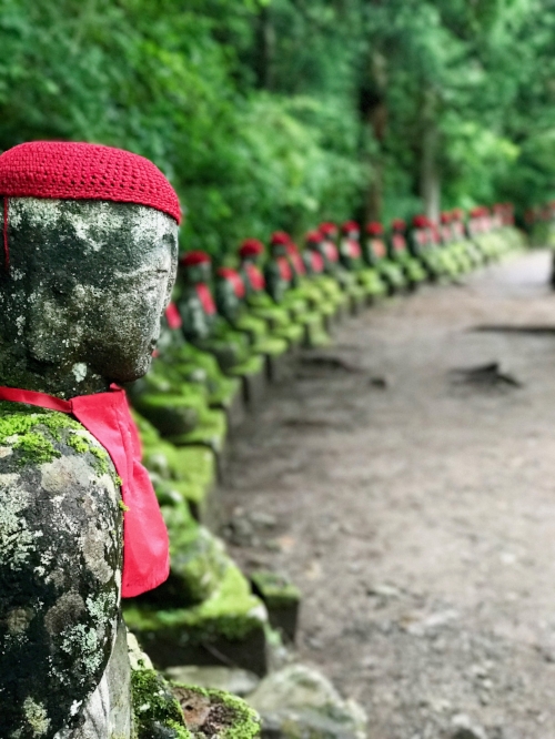
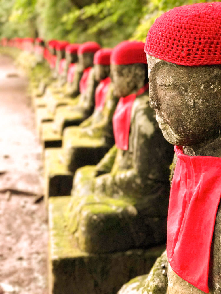
Taken on the way to the Kanmangafuchi Abyss in Nikko, Japan. This status represents Jizo Bosatsu, the guardian of children in Japanese tradition.
Okay, that’s it — this was a long post, but I hope you enjoyed seeing these photos as much as I enjoyed taking them! And if you have thought of adding Japan to your list, I can’t recommend it enough… and I didn’t even tell you about the incredible sushi and fresh fish we had!
Until next time,
Jaquilyn
WATCH the masterclass
WORKBOOKS & DOWNLOADS
A-to-Z LIST OF LUXURY WORDS
GUIDE TO BRAND MESSAGING
START BLOGGING FOR SEO
Printable Workbook
Our Go-To Lexicon!
Guide + Checklist