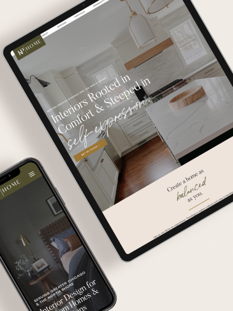
Case Study: Brand Messaging & Website Copy for KP Home

Meet Kristen, an interior designer with a flair for sophisticated, expressive interiors with an edge. When she founded KP Home, her website was “good enough” to get started. But at some point, her success started to outgrow it. She was ready for a rebrand.
Kristen found her brand and website designer first, and then reached out to us (after discovering O&B through a referral) for website copy. Her goals? She hoped to:
- Define the voice of her brand
- Target her ideal client
- Have a clear brand identity
- Stop overthinking the what and how of website copy
Brand strategy and copywriting is what we do! Kristen found us through a referral, and it was a perfect match. She’s super sweet, down-to-earth, and a great collaborator. We defined her project scope to include:
- Brand messaging strategy
- Website copy
- 3 blog articles
STEP 1: DISCOVERY PROCESS
Our creative process always starts with a comprehensive brand questionnaire and 90-Minute Strategy Session. In fact, we bet it’s very similar to the beginning of your design process — form follows function, and this stage is all about defining what that function is.
“The prep work was immensely helpful. It made me think about my brand in a different way and with the ideal customer at the center. I had taken the steps to identify that customer but not their why or how, which is core to the messaging.”
— Kristen Pipal
We couldn’t agree more. Digging into what makes your clients tick, along with why YOU are so passionate about serving them, is where we find the magic that makes your message stand out to the right people.
STEP 2: BRAND MESSAGING STRATEGY
Our team then took our learnings and worked behind the scenes on Kristen’s Brand Messaging Strategy. We aligned it with the brand work her website designer, Katie & Co., had developed, presented it to Kristen, made slight updates with her feedback — et voilà — it was ready! We won’t give away Kristen’s specific strategy, but it included:
- Ideal client profiles
- Client pain points
- How to create client connection
- Core values + how to express them
- Brand word bank
- Mission statement + tagline
- Marketing content ideas
As you can imagine, defining and consolidating these key points is invaluable. We deliver it in a beautiful PDF, enabling you, your team, and any future contractors to quickly understand how to represent your business authentically, both behind the scenes and when interacting with clients.
“Seeing (or really hearing) my brand’s voice from another perspective gave me a refreshed approach. I now have more clarity on how to leverage my messaging across the website, social, etc.”
— Kristen Pipal

STEP 3: WEBSITE COPY & BLOG ARTICLES
Most website designers prefer to have the website copy before creating the design, and we agree with this order. It allows for more customization, rather than trying to fit the copy into a predetermined structure. (Not unlike trying to design with a pre-established floor plan vs. designing custom.)
That said, we have to know what needs to go on each page. We held a Website Mapping Session with Kristen (and all our clients), where we “map out” the content of the website, page by page, considering the user experience of a potential client. The goal is to inform, connect, build trust, and guide them to the contact form.
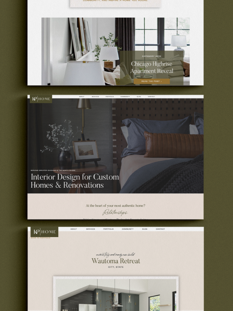
We created copy for KP Home for the following pages:
- Home
- About
- Services
- Portfolio w/Project Descriptions
- Community
- Blog w/3 articles (an add-on option)
- Contact
- FAQs (in the footer)
- Partnerships (in the footer)
Kristen’s web design team took the copy, designed the website around it, and launched the final version in September 2022! And this team effort looks spectacular. You can see the full website here.
“Everything came out exceeding all expectations.”
— Kristen Pipal

RESULTS & OUTCOME
Although Kristen’s website launched just last month, she shared some early successes that are impacting her work already:
- Tons of positive feedback on the website
- Knowledge that it will continue to pay dividends as she reaches more clients
- More confidence in sharing her brand with the world
- A feeling that she has valuable blog posts to market her business
- Saved time, so she can focus on other areas of her business
She also shared this success story:
“I recently met someone that checked a lot of the ideal client boxes and giving her my card for the website was done with such confidence knowing the messaging was targeted to her demographic.”
— Kristen Pipal
That’s a big win, and we can’t wait to watch her thrive even more in the months to come. (GO, KRISTEN!)
So, how about you? Do you struggle with your message? Is your website not speaking to the right client? Do you know what makes you stand out from the crowd?
If not, let’s talk about it.
Cheers,
Team O&B
WATCH the masterclass
WORKBOOKS & DOWNLOADS
A-to-Z LIST OF LUXURY WORDS
GUIDE TO BRAND MESSAGING
START BLOGGING FOR SEO
Printable Workbook
Our Go-To Lexicon!
Guide + Checklist